DRAKON-Erlang: Visual Functional Programming
By Stepan Mitkin
Part 3 of 10
Branching
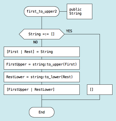
There is a bug in the first_to_upper function mentioned before. If the input is an empty string, that function will crash.
Lets us add a check for that special case.

The "If" icon chooses the code path based on a question which can be answered yes or no. The "If" icon has two exits. The first exit comes out of the bottom and goes down. The second one comes out of the right side of the icon and goes to the right.
Placing an exit on the left side is not allowed. This is a very strict rule. The point of having this rule is again to make use of human habits. When the exits are at the expected locations, the user does not need to look around and search for what happens next. He just follows the usual pattern. The user can concentrate on the algorithm itself, instead of the diagram that represents it.
The exits are marked with labels YES and NO:
- The labels can be swapped.
- If YES goes to the right, NO goes down.
- If NO goes to the right, YES goes down.
Note that the words yes and no are used instead of TRUE and FALSE. TRUE and FALSE sound scientific, but they are not convenient. Yes and no are much more natural, because these are the words that children learn very early.
The shape of the "If" icon has also been optimized for better ergonomics. On traditional flowcharts, "If" is drawn as a diamond. DRAKON cuts off the top and the bottom vertexes of the diamond. This way, the "If" icon occupies less space and can fit more text inside.
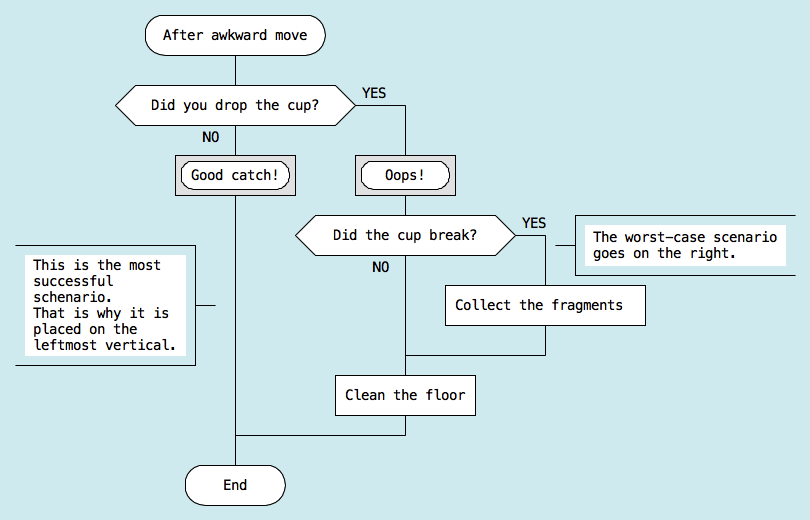
The exits of an "If" icon are not equal. The less desired outcome of the "If" icon should go to the right. The exit that leads to a greater success should go down.
Because of this, the happy path through the algorithm remains on the leftmost vertical.
If there are several "If" icons, there can be more than two verticals. The happy path should still be on the leftmost vertical. Unpleasant situations and error handling should be located further to the right on the diagram.

Rule: The further to the right ⎯ the worse.

Let us look at the modified version of the first_to_upper function again. An empty string is a special case. This is why this situation is handled on the right vertical.
The ability to visually distinguish between good paths and not so good ones is a unique feature of DRAKON. It adds an additional dimension to the diagram. The reader can immedately see how badly things have gone in a particular icon depending on the position of that icon on the diagram.
Another advantage is that if the reader is not interested in error handling, he can just follow the happy path and skip everything else.
There is another important rule related to horizontal lines produced by "If" icons.
No icons are allowed on horizontal lines.
This rule ensures that:
- The next icon is always below the current one.
- Each icon has exactly one entry.
- The entry is always at the top of the icon.
As a result, diagrams receive a consistent look.
Contact: drakon.editor@gmail.com