DRAKON-Erlang: Visual Functional Programming
By Stepan Mitkin
Part 5 of 10
No Intersections
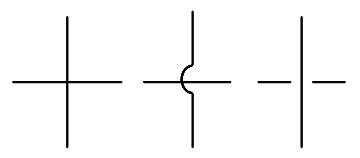
Line intersections kill readability. They quickly turn a diagram into an entangled clutter. A diagram with intersections takes much more time to understand.
There have been attempts to make intersections look less ugly.

All these attemptes failed.
The truth behind intersections is that they produce diagrams that are not planar. Those non-planar diagrams cannot be drawn on a sheet of paper without introducing the third dimension. In that case the reader must visualize the depth of the diagram. That leads to additional work imposed on the brain.
This is why DRAKON forbids intersections.
Contact: drakon.editor@gmail.com